2013JakeWilson
Hello there, welcome to my blog. feel free to leave any comments! You will find a variety of posts on the background research and planning into my slasher film opening, High Royds, being co-produced with GeorgeH and CurtisT. This blog is mainly influenced by the work of John carpenter and his franchise, Halloween.
Thursday, 9 May 2013
Welcome
Hi there welcome to my blog, i am an AS student studying Media studies. Feel free to look through my posts...
Wednesday, 8 May 2013
Tuesday, 7 May 2013
Evaluation Q1 Conventions
In what ways does your media product use, develop or challenge forms and conventions of real media products?
I add much more detail below, but here's a vodcast with a summary of some key conventions I observed from analysing film openings.
Idents
 In all of the films i have watched there is at least 1 ident at the start of the film from your slashers to your harry potters they all start with a company ident. The ident is almost always animated or has a moving part, if not it is just plain text. The film i have seen which uses just the plain text is halloween with dimension films this uses just a simple ident, the most simple i have seen in all the films i have watched.
Editing and Sound
 There are many editing conventions we used in our opening. One of the main conventions we used is Laura Maulvey's Theory of the male gaze, we used editing to focus on Heathers legs and show that she is the archetype scream queen. We also used editing to show that it is a POV shot of the killer as we made it a circular view of everything so you can just see through what would be the eye. We also used shakey camera techniques to make it more realistic when walking etc. We Also signified the protagonist by this POV shot as he is stalking the house, with a shot of him in the window. In all the slashers i observed this, The slashers signify the protagonist by them stalking the Victim using things like POV shots.
Another editing technique we used is cross cutting, from the killer to the Dr at the start of our opening, this created alot of tension. The panic editing makes the viewer feel more uneasy. this is used in all the slashers i observed. The classic example of this is the psycho shower scene when the did numerous shots within a very short space of time to create more panic.
We used continuity editing to make the opening much more flowing by using traditional techniques like the 180 degree role and match on action.
narrative
in most slasher film openings it goes with Todorovs theory of equilibrium, this is that the film starts with equilibrium it is all calm etc. then it gets into dis-equilibium with a murder or disruption of some sort. It then goes to new equlibrium after disequilibrium. Our film however was different and was more inspired by Texas Chainsaw Massacre as it starts with dis-equilbrium into equilibrium.
We also went with the slasher convention of using narrative enigma to hide the killers identity, we did this mainly by POV shots, completely inspired by Halloween as Michael Myers approaches the house, which is exactly what our character is doing.
I add much more detail below, but here's a vodcast with a summary of some key conventions I observed from analysing film openings.
Idents
 In all of the films i have watched there is at least 1 ident at the start of the film from your slashers to your harry potters they all start with a company ident. The ident is almost always animated or has a moving part, if not it is just plain text. The film i have seen which uses just the plain text is halloween with dimension films this uses just a simple ident, the most simple i have seen in all the films i have watched.
Editing and Sound
 There are many editing conventions we used in our opening. One of the main conventions we used is Laura Maulvey's Theory of the male gaze, we used editing to focus on Heathers legs and show that she is the archetype scream queen. We also used editing to show that it is a POV shot of the killer as we made it a circular view of everything so you can just see through what would be the eye. We also used shakey camera techniques to make it more realistic when walking etc. We Also signified the protagonist by this POV shot as he is stalking the house, with a shot of him in the window. In all the slashers i observed this, The slashers signify the protagonist by them stalking the Victim using things like POV shots.
 Another editing technique we used is cross cutting, from the killer to the Dr at the start of our opening, this created alot of tension. The panic editing makes the viewer feel more uneasy. this is used in all the slashers i observed. The classic example of this is the psycho shower scene when the did numerous shots within a very short space of time to create more panic.
We used continuity editing to make the opening much more flowing by using traditional techniques like the 180 degree role and match on action.
narrative
in most slasher film openings it goes with Todorovs theory of equilibrium, this is that the film starts with equilibrium it is all calm etc. then it gets into dis-equilibium with a murder or disruption of some sort. It then goes to new equlibrium after disequilibrium. Our film however was different and was more inspired by Texas Chainsaw Massacre as it starts with dis-equilbrium into equilibrium.
We also went with the slasher convention of using narrative enigma to hide the killers identity, we did this mainly by POV shots, completely inspired by Halloween as Michael Myers approaches the house, which is exactly what our character is doing.
Some other Conventions used
Our first convention was the sound of the crows as heard in the opening of The last house on the left we felt this would link in well as the patient escaped the mental asylum as the sound of crows screeching is recognised with horror which is why it links well with our opening. As we wanted the audience to have some anticipation to what was going to happen.
Another convention linked in with sound was the rock music that we used. The music comes from Red Hot Chili Peppers - Cant Stop. Rock music was used in The Return of The Living Dead which is why we used to use this convention. It also links in with the death as the music stops as the 'scream queen' is killed.
The POV camera shot was another convention we used however this convention has not been used many times in films we have seen apart from Halloween which is where we got our shot form as our killer hides behind the bushes to give the audience a sense of view from the killer
The convention of a false scare is not just apparent in most slasher films but in almost any horror film as well. The false scare brings up the audiences sense of anticipation to then relieve them to make the real scare of a much more significance to the audience [reference/link an eg]
The final girl was a new addition to our film opening, the convention of a scream queen is in a lot of slasher movies. We took our convention from Nightmare On Elm Street the scream queen was Heather Langenkamp who played Nancy. To anchor our final girl we used revealing clothes and made it apparent to our audience that she was sexually active.
With our final girl we also played up to Laura Mulvey's male gaze theory. She believes that audiences have to view characters form the view of a hetrosexual male. Our camera lingers on parts of the female body in context of a males reaction. We used this to appeal to a wider male audience.
We went with the Classic kitchen knife as our chosen weapon, this was inpired by Michael Myers from halloween, as his choice of weapon was the exact same, a kitchen knife
This is our slasher genre overview
Our film titles
Here i will show what inspired our titles from looking at key conventions from some of the slasher films.
In our film, at the beginning we provide exposition, as our film is inspired largely by Halloween we felt that we should take inspiration from the film. Therefore we provided the location at the start of our film opening saying 'High Royds' this was to introduce the film and to give the audience a sense of where the location is.
 |
| Crow sounds |
 |
| Rock Music |
Another convention linked in with sound was the rock music that we used. The music comes from Red Hot Chili Peppers - Cant Stop. Rock music was used in The Return of The Living Dead which is why we used to use this convention. It also links in with the death as the music stops as the 'scream queen' is killed.
 |
| POV shot |
The POV camera shot was another convention we used however this convention has not been used many times in films we have seen apart from Halloween which is where we got our shot form as our killer hides behind the bushes to give the audience a sense of view from the killer
 |
| False Scare |
The convention of a false scare is not just apparent in most slasher films but in almost any horror film as well. The false scare brings up the audiences sense of anticipation to then relieve them to make the real scare of a much more significance to the audience [reference/link an eg]
 |
| Scream Queen |
The final girl was a new addition to our film opening, the convention of a scream queen is in a lot of slasher movies. We took our convention from Nightmare On Elm Street the scream queen was Heather Langenkamp who played Nancy. To anchor our final girl we used revealing clothes and made it apparent to our audience that she was sexually active.
 |
| Male Gaze Theory |
With our final girl we also played up to Laura Mulvey's male gaze theory. She believes that audiences have to view characters form the view of a hetrosexual male. Our camera lingers on parts of the female body in context of a males reaction. We used this to appeal to a wider male audience.
 |
| Weapon |
We went with the Classic kitchen knife as our chosen weapon, this was inpired by Michael Myers from halloween, as his choice of weapon was the exact same, a kitchen knife
This is our slasher genre overview
This is our vodcast on conventions that we did in our group.
Our film titles
Here i will show what inspired our titles from looking at key conventions from some of the slasher films.
In our film, at the beginning we provide exposition, as our film is inspired largely by Halloween we felt that we should take inspiration from the film. Therefore we provided the location at the start of our film opening saying 'High Royds' this was to introduce the film and to give the audience a sense of where the location is.
We then took another inspiration from Halloween and provided another bit of exposition with providing the times/dates of when the scenes are. This also gives the viewer a sense of time and information. As the film is not continuous exposition is needed for the viewer.
Here is the titles of the film SAW it is a sequence of titles after the short introduction, just like our film. it has the effect of running blood down the screen then has the letters in blood like effect, this is the kind of inspiration that gave us to do our titles and what our titles are going to look like.
In the titles of Halloween it introduces two of the main characters, with their name in big letter the 'in'. this is because the names of these two are either recognised or are main parts in the film. As me and Curtis Tiplady are both recognised names in our media society from doing the swede and the micro-drama, we are going to do the same as this
Monday, 6 May 2013
Eval Q2 Representations tbc
How does your media product represent particular
social groups?


The Killer character is inspired by Halloweens Michael Myers, as he represents a psychopathic patient and also he influenced our choice of weapon, the classic kitchen knife
Jake - Dr. Cruger
The Dr
The Dr is also very influenced by Halloween and Dr Loomis. He is a Dr at the mental asylum who looked after Peter. He made peters life hell inside the asylum, then killed by Peter himself. Dr Loomis was also Michaels Dr, getting killed in the process just like our Halloween inspired film.
Heather
Heather is the Scream queen in our film. Like your stereotypical scream queen she wore very little clothes, also revealing clothes, shes blonde and most importantly in our film opening she is sexually active as there is a sex scene in our opening to show this. We had a scene in the opening in which the scream queen gets killed, this was very much inspired by psycho as the same blonde scream gets killed in the bathroom. Our character heather was very much inspired by the psycho scream queen as she is blonde and sexually active. The bathroom being even more so.
Location
All of our characters are from north of england, which isn't popular and
very weird for Americans as most British films are set down south of england.
Therefore our audience may not be in america. However The slasher genre is a
very unique genre as people don't seem to care as much about what country/county
it is set in they just like the gore and the thrill they seem to get from
watching it! So that's why were not overly bothered about where the film was
set as long as the locations were good, we felt it could appeal to any
audience.
Age
All our actors/actresses are teenagers aged from 16 - 17. However we wanted the audience to feel like the Dr and his girlfriend were older in their late 20's, this was to appeal to a larger audience yet still appeal to the older audience.
Costume/Clothes
Dr
Here we have a shot from in the cupboard it shows the costume of the Dr. As he is a Dr it is a smart uniform he is wearing, i chose chino trousers and a smart shirt buttoned up as this is what was in our mind as a stereotypical Dr from first hand experience and from watching television. To add to the costume we used my Driving license as an identity for the Dr, as we thought it would add to the stereotypical look.
HeatherHere we have the bottom half of what our scream queen was wearing, we asked her to wear shorts as this shows a lot of skin especially with the top she was wearing as well. This was used as it is very stereotypical of the scream queen archetype to be blonde and wear revealing clothes.
The killer
This is the killer running from the Asylum. The killers costume, is inspired by the patients escape. He is wearing the Dr's lab coat and was the reason he was able to escape by disguise. We went to the schools biology department and they let us borrow the lab coat, this worked very effectively
CAST/CHARACTERS SUMMARY
Cinematographer/Director: George Holmes, Jake Wilson
Curtis - 'Peter'
Reasons for:
- Young
- Good actor for an important role

The Killer character is inspired by Halloweens Michael Myers, as he represents a psychopathic patient and also he influenced our choice of weapon, the classic kitchen knife
Jake - Dr. Cruger
Reasons for:
- Looks like a doctor
- Reasonable actor for important role
- looks smart
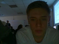


The Dr character (me) represented the archetype that is Dr Loomis from Halloween, basically the Dr of the psychopathic patient.
Heather- Dr's Wife (scream queen)
Heather- Dr's Wife (scream queen)
- Blonde
- Takes drama for an AS level
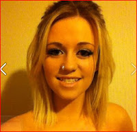
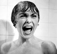


Heather Represented the stereotypical scream queen, which is just like the archetype Janet Leigh off of the slasher psycho
My Vodcast on representations
My Vodcast on representations
The Killer |
| Michael Myers |
Peter is a mental asylum patient who has escaped from the Asylum in
which the doctor works. He then comes back to kill his doctor and his wife in
his own home. Peter wears a lab coat stolen from the asylum and wears this
throughout our opening for the effect and it looks good. influenced by the
slasher film Halloween and the patient and the main killer in the film
Michael Myers who has also escaped from a mental asylum.
| Dr Loomis |
The Dr
The Dr is also very influenced by Halloween and Dr Loomis. He is a Dr at the mental asylum who looked after Peter. He made peters life hell inside the asylum, then killed by Peter himself. Dr Loomis was also Michaels Dr, getting killed in the process just like our Halloween inspired film.
Heather
| Janet Leigh |
Location
 |
| High Royds West Yorkshire |
Never- the-less if a big budget was given to us, america or southern
England would probably be where we chose as more
people recognize these actors and scenic locations.
All our actors/actresses are teenagers aged from 16 - 17. However we wanted the audience to feel like the Dr and his girlfriend were older in their late 20's, this was to appeal to a larger audience yet still appeal to the older audience.
Costume/Clothes
Dr
Here we have a shot from in the cupboard it shows the costume of the Dr. As he is a Dr it is a smart uniform he is wearing, i chose chino trousers and a smart shirt buttoned up as this is what was in our mind as a stereotypical Dr from first hand experience and from watching television. To add to the costume we used my Driving license as an identity for the Dr, as we thought it would add to the stereotypical look.
HeatherHere we have the bottom half of what our scream queen was wearing, we asked her to wear shorts as this shows a lot of skin especially with the top she was wearing as well. This was used as it is very stereotypical of the scream queen archetype to be blonde and wear revealing clothes.
The killer
This is the killer running from the Asylum. The killers costume, is inspired by the patients escape. He is wearing the Dr's lab coat and was the reason he was able to escape by disguise. We went to the schools biology department and they let us borrow the lab coat, this worked very effectively
Sunday, 5 May 2013
Q3 Distributor tbc
Definition:
wikipedia:
'A film distributor is a company or individual responsible for the marketing of a film. The distributor may set the release date of a film and the method by which a film is to be exhibited or made available for viewing: for example, directly to the public either theatrically or for home viewing (DVD, video-on-demand, download, television programs through broadcast syndication etc.). A distributor may do this directly, if the distributor owns the theaters or film distribution networks, or through theatrical exhibitors and other sub-distributors. A limited distributor may deal only with particular products, such as DVDs or Blu-ray, or may act in a particular country or market.'5 Useful Hyperlinks:
http://www.eicar-international.com/definition-distribution.html
http://dictionary.reverso.net/english-cobuild/film%20distribution
http://entertainment.howstuffworks.com/movie-distribution1.htm
http://www.bavc.org/youth-programs/next-gen-resources/youth-media-distribution-toolkit/distribution-defined
http://en.wikipedia.org/wiki/Film_distributor
My definition: someone or a company that deals with the marketing of the film, from DVD releasing to cinema, it is the people getting the film as much money as they can, to get the film viewed by the people.
Digitisation
However now digitization has come into play, distributors can pay much less or even sometimes nothing to advertise their film, using social sites things can now go viral meaning your film advert or whatever you want to advertise can get viewed by thousands even millions of people. so an indie film like ours is benefiting greatly as we can advertise our film and get it noticed for free which is what we need as our budget is basically nothing. moving to digital reduces the costs of most things in film, everything is on memory not on film prints etc anymore. The film prints cost thousands of pounds and most country's would get the film prints later than america as it cost too much to make a vast amount of prints.
My film is an almost 0 budget slasher indie film, with no more than 5 characters and a local location, the film is easy to produce and easy to film.
Top ten UK distributors 2012:
Sony more than doubled its 2011 share of 7.35% with an enormous 17.9% share in 2012, with 'Skyfall' accounting for half its total take.
20th Century Fox came in a close second with 39 titles hauling £191.2m for a 16.3% market share.
Last year's number one, Warner Bros, fell to third with £147m, a 12.5% market share. £56.3m of this total was brought in by 'The Dark Knight Rises'.
Overall, the UK box office grossed £1.172b in 2012, narrowly ahead of 2011’s £1.130b total.
UK's top 10 2012 film distributors:
1. Sony: $336.4m (£209.9m) 17.9%
2. 20th Century Fox: $306.5m (£191.2m) 16.3%
3. Warner Bros: $235.5m (£147m) 12.5%
4. Universal: $219.3m (£136.8m) 11%
5. Walt Disney: $197.4m (£123.2m) 10.5%
6. eOne: $129.5m (£80.8m) 6.9%
7. Paramount: $125.8m (£78.5m) 6.7%
8. Lionsgate: $109.3m (£68.2m) 5.8%
9. Momentum: $82.1m (£51.2m) 4.3%
10. Entertainment Film Distributors: $59m (£36.8m)
source: http://www.mi6-hq.com/news/index.php?itemid=10724
This shows that sony are dominating the UK market as a distributor, However this isn't horror films. Here are IMDB's top 10 horror movies of all time and their distributors:
The shining, 1980- Warner Bros
Alien, 1979- 20th Century Fox
Shaun Of The Dead, 2004- Focus Features & Universal
Psycho, 1960- Paramount Pictures
Cloverfield, 2008- Paramount Pictures
Zombieland, 2009- Colombia Pictures
SAW, 2004- Lionsgate Films
The Exorcist, 1973- Warner Bros
28 Days Later, 2002- Twentieth Century Fox
Sweeney Todd, 2007- Dreamworks
Distributors marketing methods:
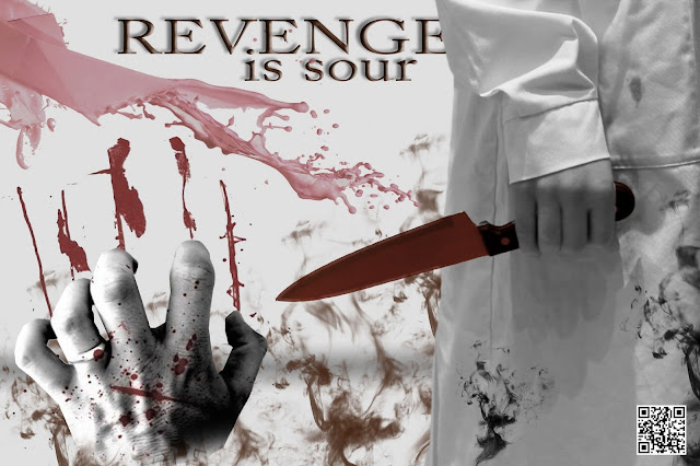
This was the poster we created. Basically all slasher films use posters to attract the audience and give a brief insight to the film. Here is a poster from the infamous film Halloween:
Another technique distributors use is use a teaser trailer before the trailer and obviously before the film, this is to give the audience an idea of what it's going to be like and advertises the film greatly. With digitization this is much easier as sites like Youtube provide free video time with the potential to go viral. Here is our teaser trailer and another example of a teaser trailer:
Our teaser trailer:
Saw VI teaser trailer:
sadly i do not think my film will achieve such a distributor like any of these in the top ten, therefore i have done research into a distributor which would distribute an indie film like mine:
Donkey Punch Budget: 700k
Donkey Punch Distributors:
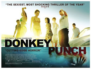
•Optimum Releasing (2008) (UK) (theatrical)
•Magnet Releasing (2009) (USA) (theatrical)
optimum releasing:
http://www.imdb.com/company/co0106149/
Who have distributed the film: donkey punch
Eden lake:
Distributors:
•Optimum Releasing (2008) (UK) (theatrical)
•Dimension Extreme (2009) (USA) (DVD)
•Weinstein Company, The (2009) (USA) (DVD)
Our budget
The budget for our film will be was zero. as we borrowed a lab coat from the biology department at school, however if we were to state a budget to make our whole film if we could get distribution would be a film like le donk & scor-zay-zee a low budget comedy produced by warp and written by Shane Meadows. this is a micro budget indie, which is what we're trying to achieve. 48,000 would cover the rent of cameras, actors and props and a setting if needed. so if we were to set a budget 48,000 would be our target.
In the past films like Halloween psycho and scream made astronomical amounts of profit from their films, the distributors contributing to this, dimension, Halloweens distributor made ALOT of money, as it was a low budget film grossing 60 million. However in the competitive Slasher and Horror genre that it is today it is much harder for these low budget films to make much money. The horror film Paranormal Activity is a great exception as the film made huge profits on its very, very low budget film:
Budget:
$15,000 (estimated)
Opening Weekend:
£3,593,762 (UK) (27 November 2009)
£3,593,762 (UK) (27 November 2009)
Gross:
$107,917,283 (USA) (15 January 2010)
Distributors
$107,917,283 (USA) (15 January 2010)
Distributors
- Paramount Pictures (2009) (USA) (theatrical)
- DreamWorks SKG (2009) (USA) (theatrical)
This is the Kind of budget we are working along and an inspiration to our film, so if our film got a USA cinema release these 2 distributors would be ideal.
Conclusion:
If money was no object however our Ideal distributor would definitely be Dimension Films because of it variety of films it has distributed from Halloween to Scream 4. especially the fact that our film is very much inspired by Halloween. The distributor has almost guaranteed distribution for every horror film it has diistributed.
If money was no object however our Ideal distributor would definitely be Dimension Films because of it variety of films it has distributed from Halloween to Scream 4. especially the fact that our film is very much inspired by Halloween. The distributor has almost guaranteed distribution for every horror film it has diistributed.
Saturday, 4 May 2013
Evaluation Q4
Who would be the audience for your media product?
Our primary audience: 15-25
Secondary audience: 26-35
We first of all went to Ben, who is in the age range of our target audience. We asked him to watch the video and give us some feedback on whats good and whats bad about our opening, this was to help us understand what our audience want and what we need to improve.
This is the feedback ben gave us:
The BBFC guidelines for a 15 classification allows the following to appear in films:


The Killer character is inspired by Halloweens Michael Myers, as he represents a psychopathic patient and also he influenced our choice of weapon, the classic kitchen knife. Curtis is used as a selling point of the film as he is a young psychopathic killer. He is stereotypical of the genre and gives the audience the scare factor. As genre is one of the main ways we advertised our film having Curtis in the film was a must have.
Jake - Dr. Cruger
In our film all of the characters we used are heterosexual, This is what is considered a normative representation. There was only one scene where there was any form of sexual sexual references in the film and that was in the bedroom scene so we just went with the normative conception as none of our characters we homosexual.
We used gender in our film many times. We used techniques that other slashers use to attract and audience. For example we had abit of intertextuality with our killer with him being a psychopathic killer, this is just like Halloween and may attract an audience due to its similarities.
We also used gender with having a scream queen, using the 'male gaze' theory to attract more of a male audience as the scream queen wears clothes that show alot of skin.
Social Class:
Our film opening is very debatable to what social class it is. We would like to think it is within the c1 class. Never-the-less there is very little dialogue so it is debatable that the film is of a lower class as there isn't very much intellect.
Our primary audience: 15-25
Secondary audience: 26-35
We first of all went to Ben, who is in the age range of our target audience. We asked him to watch the video and give us some feedback on whats good and whats bad about our opening, this was to help us understand what our audience want and what we need to improve.
This is the feedback ben gave us:
Below are the Certificate pictures for age ratings in Britain.
| Universal | Suitable for all | |
| Parental Guidance | General viewing, but some scenes may be unsuitable for young children | |
 | 12 Accompanied/Advisory | Suitable for those aged 12 and older (cinema only); under 12s admitted, but only if accompanied by an adult |
 | 12 | Suitable for those aged 12 and older (VHS and DVD only) |
 | 15 | Suitable for those aged 15 and older |
 | 18 | Suitable for those aged 18 and older |
| Restricted 18 | Restricted to those aged 18 and older and only available at licensed cinemas and sex shops. The latter will not require a licence to sell R18 films |
We have rated our film as a 15 due to the fact that our film doesn't contain any explicit nudity, however it does contain sexual references and violence form the outset and throughout. this inspired our primary target audience as people under the age of 15 are not aloud to watch this film. Never-the-less we know that it is quite likely people under 15 will watch it.
The BBFC guidelines for a 15 classification allows the following to appear in films:
- strong violence
- frequent strong language
- portrayals of sexual activity
- strong verbal references to sex
- sexual nudity
- brief scenees of sexual violence or verbal references to sexual violence
- discriminatory language or behaviour
- drug taking
Characters
Curtis - 'Peter'
Curtis - 'Peter'
Reasons for:
- Young
- Good actor for an important role

The Killer character is inspired by Halloweens Michael Myers, as he represents a psychopathic patient and also he influenced our choice of weapon, the classic kitchen knife. Curtis is used as a selling point of the film as he is a young psychopathic killer. He is stereotypical of the genre and gives the audience the scare factor. As genre is one of the main ways we advertised our film having Curtis in the film was a must have.
Jake - Dr. Cruger
Reasons for:
- Looks like a doctor
- good actor for important role
- looks smart


The Dr character (me) represented the archetype that is Dr Loomis from Halloween, basically the Dr of the psychopathic patient. i was used more as obviously the victim however i attracted more of the secondary audience as i was a character that was in his late 20's
Heather- Dr's Wife (scream queen)
Heather- Dr's Wife (scream queen)
- Blonde
- Takes drama for an AS level
- Fits in with the archetype of a scream queen


- Fits in with the archetype of a scream queen


Heather Represented the stereotypical scream queen, which is just like the archetype Janet Leigh off of the slasher psycho. she was used to attract the male audience as we used editing and costume to go with Laura Mulveys theory of the male gaze.
My Vodcast on Target Audience
Sexuality:
Gender:
We also used gender with having a scream queen, using the 'male gaze' theory to attract more of a male audience as the scream queen wears clothes that show alot of skin.
Social Class:
Our film opening is very debatable to what social class it is. We would like to think it is within the c1 class. Never-the-less there is very little dialogue so it is debatable that the film is of a lower class as there isn't very much intellect.
Physical Ability/Disabilty:
Our opening only contains physical able characters, this wasn't planned it was just due to the fact that we couldn't find any disabled characters to fit our roles as within our production team we had no budget and no volunteers that were disabled.
Nationality and region:
Audience for this Genre:
The slasher genre is a genre that has been going since 1932 the slasher genre is still strong to this day making vast amounts of money so there is obviously still a big audience for this genre. Here are some slasher Box Office figures:Psycho (1960) made $32m at the US Box Office.
Halloween (1978) made $47m at the US Box Office.
A Nightmare on Elm Street (1984) made $10.8m at the US Box Office.
Scream (1996) made $103m at the US Box Office.
Saw (2004) made $55.2m at the US Box Office.
Our film is set in Yorkshire so our audience is within the UK as it is un-recognisable to the american audience. As all the settings are in Yorkshire aswell as the characters it is very likely that the majority of our audience will be form Yorkshire or at least up north. We hoped that our setting would anchor the region but if it doesn't the characters should due to the accents used.
Like Warp another low budget indie film company they target a regional and national audience rather than an international audience. This is very similair to our production company as we couldn't get the distribution deal to appeal to anywhere else in the world as well as the fact it is just not our focus unlike a company like Working Title who are a complete Binary opposite to us
The slasher genre is a genre that has been going since 1932 the slasher genre is still strong to this day making vast amounts of money so there is obviously still a big audience for this genre. Here are some slasher Box Office figures:Psycho (1960) made $32m at the US Box Office.
Halloween (1978) made $47m at the US Box Office.
A Nightmare on Elm Street (1984) made $10.8m at the US Box Office.
Scream (1996) made $103m at the US Box Office.
Saw (2004) made $55.2m at the US Box Office.
our film is very indie and it is almost impossible to compete with the likes of these films. Even with a Warp like budget it is still very hard to compete with the big 6 in producing and distributing slasher films. We would like to compare ourselves to warp as we have only tried to appeal to an English audience by the setting and characters, not concentrating on an american appeal.
Subscribe to:
Comments (Atom)


